
Know what to build.
We work through your business goals, the people using the product and the tasks they need to complete. Together, we define the priorities and scope of the next version.
Mobile apps and web interfaces.
From the first question to the last interaction.


You may be starting with an idea, improving an existing product or building a new feature. We turn that starting point into a clear plan, a distinctive interface and a working implementation.
Product thinking, visual design and development stay connected. The decisions we make together carry through to the software people use.
We work through your business goals, the people using the product and the tasks they need to complete. Together, we define the priorities and scope of the next version.
We organise the journeys and give the interface its own visual character. You review real screens and try key interactions in a prototype before development.
We build the agreed features, connect the services they depend on and check how the product behaves. Design decisions are reviewed in the working interface, too.
From the first decisions to release, or the part your team needs next. See how we work
Explore our banking app.
Choose a scenario.
Try it for yourself.
In the banking app, someone moves from an overview to a decision and a clear next step. We work through that whole journey for your product: what people need to know, what they can do and what happens afterwards.
The relevant information is in reach. People can compare their options and understand what an action will change before they commit.
The interface responds. It shows progress, explains a problem and gives people a clear way to recover and continue.
The result is clear. People can see what changed and where to go next, without having to guess whether it worked.
A quick mobile task and a team workspace need different ways of organising information.
For web apps and dashboards, we bring status, details and actions into one clear structure. Your team can see what needs attention, open the context and move the work forward.
The character of a product lives in the details. How it reads. How it responds. How it helps someone move forward.
Information architecture turns a complex product into a path people can follow.

Real needs, habits and context shape the decisions.

A system of components, typography and behaviours that holds together.
Hierarchy gives the important things their place.
Show the effect of a decision before asking someone to confirm it.
Try this interaction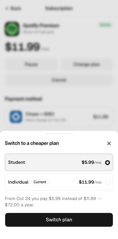
Empty, loading, error and success states belong to the experience.
Each stage turns an open question into a decision we can build on. We agree on the scope, review key decisions together and revisit assumptions when the work reveals something new.
We examine the business, the people and the context of use to establish what the product needs to achieve. We identify the questions that matter, then choose the researches needed to answer them.
Depending on the project, this can include:
We bring the findings together into a product brief, priorities and hypotheses that guide design decisions.
We define the information people need at each step and the decisions they make along the way. From there, we develop the information architecture, navigation, content hierarchy, user flows and screen prototypes.
Prototyping lets us examine the main scenarios and the logic of important interactions, including the moment before someone commits to an action. We review key journeys and use appropriate testing to resolve questions before detailed design.
The outcome is a clear set of user journeys and a structural foundation for the product, with the main scenarios worked through.
We explore how the product should look, feel and behave. Typography, composition, colour, interaction and motion form a visual direction grounded in the product brief.
We demonstrate the direction on representative screens and interactions, explain the reasoning behind it and refine the selected concept with your team.
The outcome is an agreed visual language that can carry across the product.
We bring the structure and visual direction together in the final screens. This is where the concept develops into a complete interface, with reusable components, responsive behaviour and the states around each action.
We work through realistic content and data, different screen sizes and the details of important journeys, including empty, loading, error and success states.
The system of components, typography and behaviours is developed to match the scale of the product and support future features.
The outcome is a coherent interface ready for development.
We build the agreed scope: screens, interactions, states and the integrations defined before work begins. Design review continues throughout development so that typography, layout, motion and behaviour retain their intended quality in the working product.
We test key journeys, forms and interface states, accessibility and performance across the agreed platforms and devices, and review the build against the design.
The outcome is a working implementation of the agreed scope,
prepared for release.
We prepare the product for release on the agreed platforms and check that key scenarios and agreed analytics events work correctly once it is released. For an existing product, we plan how current users move to the new version.
The success criteria established during analyses guide what we measure.
We provide the agreed handover materials and review the first results of the release with your team.
Additional iterations are available after launch.
We review user feedback and available product data, prioritise opportunities and agree on the next improvements.
Each cycle can address flows, interactions, content, new screens or functionality. Changes are evaluated against the product’s goals and the evidence available.
The scope and cadence of this work are agreed separately.
The outcome is a released product, with the agreed measurement
in place to guide its next improvements.
Your project comes with a clear product structure and detailed interface designs. With development included, you also receive a working implementation of the agreed features.
Figma files with the agreed screens, key journeys and interface states. Layouts and reusable elements give designers and developers a clear reference for the next stage.
Our React web builds use shared components for forms, navigation and other repeated parts. Layouts adapt to different screens, while new features grow from the same design and behaviour.
We connect the agreed APIs and services, then check the key journeys, responsive layouts and loading, error and success states. You review a working version before release.
The agreed design files, source code and setup notes are handed over to your team. We confirm what is ready, how to run it and who will handle release and ongoing maintenance.
If the product needs a broader design system, we can build a Figma library and matching React components, with guidance on how to use them. Future screens can then share the same visual language and behaviour.
We agree the depth of the system, integrations and technical scope with you. The stack for native mobile apps is chosen separately for the project.
Share who it’s for, what it needs to do and where
you are now. Use the short form on the rightbelow.
We’ll reply by email with the next step.
© 2026 SKARR.PRO